- Published:
- 6 Minute Read
The Importance of Responsive Web Design for Modern Websites
Written By:

Author
Introduction
In today’s digital landscape, having a responsive website is no longer optional—it’s essential. With more than half of all web traffic coming from mobile devices, businesses must ensure their websites adapt seamlessly to different screen sizes. A poorly optimized site can lead to frustrated users, high bounce rates, and lost revenue.
At MWD Web Design, we specialize in creating responsive, user-friendly websites that enhance user experience, improve SEO rankings, and drive conversions. In this blog, we’ll explain why responsive web design (RWD) is crucial and how it can benefit your business.
What Is Responsive Web Design?
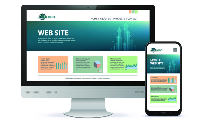
Responsive web design is an approach that allows websites to automatically adjust to different screen sizes and resolutions. Whether viewed on a desktop, tablet, or smartphone, a responsive site maintains usability, readability, and aesthetic appeal.
The key components of responsive design include:
Fluid Grid Layouts – Ensuring website elements resize proportionally.
Flexible Images & Media – Preventing images from distorting or overflowing.
CSS Media Queries – Applying different styles based on screen width.
By implementing these techniques, websites become more adaptive and user-friendly, ensuring a seamless browsing experience for all visitors.
Why Responsive Web Design Matters
A responsive website directly impacts SEO, user experience, and business performance. Here’s why it’s a must-have:
1. SEO Benefits
Google prioritizes mobile-friendly websites in search rankings. With mobile-first indexing, Google primarily evaluates the mobile version of a site. A responsive design helps improve search engine rankings by enhancing:
Page speed, which is a key ranking factor.
User engagement, leading to lower bounce rates.
Content consistency, ensuring all users access the same information. You can test your website speed with Google here.
2. Better User Experience (UX)
A website that functions well across devices keeps visitors engaged. If users struggle with navigation, readability, or slow load times, they’re more likely to leave and visit a competitor’s site instead. A responsive design improves:
- Navigation, making it easier to browse content.
- Readability, ensuring text remains clear and well-formatted.
- Interaction, optimizing buttons and forms for touchscreens.
3. Faster Load Times
Website speed plays a significant role in user retention and SEO. Responsive design helps by:
- Reducing unnecessary page elements on smaller screens.
- Optimizing images and media for quick loading.
- Ensuring efficient CSS and code structures to minimize delays.
4. Cost & Maintenance Efficiency
Managing separate desktop and mobile sites is time-consuming and costly. A single responsive website simplifies maintenance, reduces development costs, and ensures consistent branding across all platforms.
Key Principles of Responsive Web Design
To create a well-optimized website, we follow these fundamental design principles:
1. Mobile-First Approach
Starting with mobile design ensures a lightweight and fast-loading experience. From there, additional features are added for larger screens, optimizing performance across all devices.
2. Flexible Layouts & Media
By using fluid grids and scalable images, websites automatically adjust to different screen sizes without losing structure or clarity.
3. Intuitive Navigation & Accessibility
A responsive site should feature:
- Clear menus that adjust for smaller screens.
- Large, touch-friendly buttons for mobile users.
- Readable fonts and color contrast for accessibility.
4. Performance Optimization
Optimizing code, reducing unnecessary scripts, and ensuring fast server response times help keep a responsive website running smoothly.
Best Practices for Responsive Web Design
A successful responsive website follows these industry best practices:
Prioritize Mobile Usability – Design for mobile first, then scale up.
Optimize Images & Media – Compress files to improve load speed.
Ensure Readability – Use clear fonts and adequate spacing.
Test Across Devices – Check responsiveness on multiple screen sizes.
Minimize Load Time – Remove unnecessary elements to enhance performance.
By implementing these techniques, businesses can improve their online presence, user engagement, and conversion rates.
Common Responsive Design Mistakes to Avoid
Even with the best intentions, mistakes can happen. Here are some common pitfalls and how to avoid them:
Not Testing on Multiple Devices → Always preview designs on different screens.
Ignoring Page Speed Optimization → Compress images and minify code.
Overcomplicating Navigation → Keep menus simple and easy to use.
Using Fixed-Width Elements → Design with fluid layouts to ensure flexibility.
By addressing these issues early, businesses can provide a seamless and engaging experience for all users.
Conclusion
Responsive web design is more than just a trend—it’s a necessity for modern businesses. From boosting SEO rankings to improving user engagement, a mobile-friendly website is crucial for success.
At MWD Web Design, we specialize in crafting responsive, high-performance websites tailored to your business needs. If you’re looking to upgrade your site or ensure it meets modern standards, we’re here to help.
Ready to make your website fully responsive? Contact us today!